How to Choose the Best Outdoor Signage Systems?
Choosing outdoor signage systems is not simply a matter of picking the brightest display or the lowest-priced panel. The right choice depends on where the sign will sit, how people will view it, and what conditions it must withstand. A storefront beside a busy road has different needs from a trailhead exposed to wind and rain. Small details count.
Start by assessing visibility, viewing distance, available power, and daily operating hours. Then compare materials, lighting, mounting options, and maintenance needs. For example, a sign facing afternoon sun may need higher brightness and glare control. A shaded entrance may benefit more from clear contrast and readable lettering. There is no universal winner.
Reliable selection also means looking beyond the product sheet. Ask about weather resistance, expected service life, replacement parts, installation support, and warranty terms. Check whether the supplier can explain these claims with clear specifications, not vague promises. Review placement requirements for your site, too, since local rules and property conditions can affect installation.
This guide outlines the practical factors that help businesses and property managers compare outdoor signage systems with confidence. It covers sign types, materials, visibility, energy use, installation, and upkeep. The aim is useful judgment, not a perfect formula. Real sites are messy, and a choice that works on paper may still need adjustment after installation.
Define Sign Purpose, Audience, and Viewing Distance Before Selecting a System
How to Choose the Best Outdoor Signage Systems?
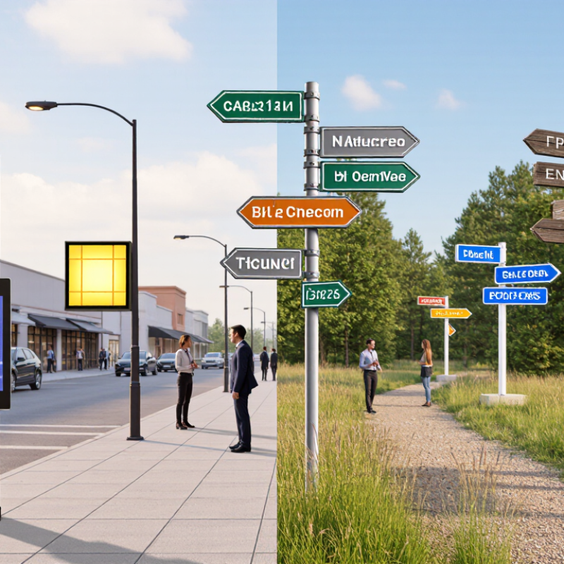
Outdoor signage should solve a clear communication problem, not just fill an empty wall. Before choosing a system, decide what viewers need to notice, understand, or do. A roadside direction sign must be recognized quickly. A courtyard information panel can support slower reading. These different tasks affect sign size, contrast, wording, and placement. Be specific. Identify the main audience, such as drivers, pedestrians, or first-time visitors, and consider what they already know.
Viewing distance matters as much as the message. A sign seen from across a parking lot needs larger lettering and a simple layout. At close range, smaller text may work, but glare, shadows, and busy backgrounds can still make it hard to read. Estimate the viewing distance on site, then check the sign from the actual approach angle. A rough estimate is only a starting point; parked vehicles or seasonal foliage can change visibility. That detail is easy to miss.
Tips: Photograph the location from a viewer’s position. Note the farthest point where the sign should be readable, along with lighting and likely obstructions. Keep essential wording brief, and test a draft at its intended size. If people still hesitate, the message or placement may need another look.
Check Placement and Readability Against MUTCD Sign-Visibility Guidance
When choosing an outdoor signage system, check the viewing conditions before comparing materials or mounting hardware. The MUTCD provides visibility guidance for traffic control devices, but not every business sign falls within its scope. Confirm which rules apply with the relevant road authority. Context matters.
Stand where drivers or pedestrians will approach the sign. Note their distance, direction of travel, speed, and likely viewing angle. Look for parked vehicles, branches, utility poles, and glare that could hide the message. Keep wording brief, use strong contrast, and choose letter sizes suited to the actual viewing distance. A sign that reads clearly in a workshop may fail beside a busy road. Test it in daylight and after dark.
Placement deserves equal care. Check that the sign does not block required traffic signs, sight lines, or pedestrian routes. For signs near public roads, consult the current MUTCD edition and local requirements; details can vary by sign type and location. A tidy site plan helps, but it cannot reveal every field condition. Walk the approach yourself. Then reassess after installation, when shadows, landscaping, and real traffic may expose problems the drawing missed.
Compare Materials Using ASTM G154 Accelerated UV-Exposure Testing
How to Choose the Best Outdoor Signage Systems?
Compare Materials Using ASTM G154 Accelerated UV-Exposure Testing
Outdoor signs endure sunlight, moisture, and changing temperatures. A material that looks sturdy indoors may fade, chalk, crack, or lose its finish outside. ASTM G154 provides a controlled way to compare how nonmetallic materials respond to fluorescent UV exposure and moisture cycles. It is useful for comparing sign faces, coatings, and printed samples under the same test conditions.
Check the test report before choosing. It should identify the lamp type, exposure cycle, duration, and material condition before and after testing. Look for color change, surface cracking, gloss loss, and peeling. Small details matter. A pale sample may hide fading that would stand out on a dark storefront sign. Still, accelerated testing does not predict an exact outdoor service life. Real exposure varies with climate, orientation, installation, and maintenance. I would avoid treating one strong result as a guarantee.
Tips: Compare samples tested under identical conditions, and inspect them in consistent lighting. Ask for photographs and measured color or gloss changes. Consider abrasion and temperature testing too; ASTM G154 does not cover every outdoor stress. A neat test chart helps, but it cannot replace checking the sign’s actual site conditions.
How to Choose the Best Outdoor Signage Systems?
ASTM G154 Cycle 1: Exposure per 12-Hour Cycle
Common ASTM G154 Cycle 1 conditions use 8 hours of UVA-340 exposure at 60°C followed by 4 hours of condensation at 50°C; the commonly specified irradiance is 0.89 W/(m²·nm) at 340 nm. These are test conditions, not material durability ratings. Compare signage materials by measuring property changes—such as color, gloss, or strength—before and after the same exposure. Confirm the applicable ASTM edition and test details for your project.
Specify Weather Protection with IEC 60529 IP65 Dust and Water-Jet Ratings
Outdoor signage faces more than rain. Dust can settle inside a housing, while wind-driven spray reaches seams, connectors, and cable entries. Under IEC 60529, an IP65 rating indicates a dust-tight enclosure and protection against water jets under specified test conditions. The “6” refers to dust protection; the “5” refers to water jets. That distinction matters.
IP65 does not mean the sign can be submerged or safely hit with every pressure washer. A rating alone can be misleading. Check that the complete enclosure, including access panels and cable glands, maintains its protection when assembled as intended. Look closely at mounting points, where poorly sealed holes can let water in. For a roadside sign, consider the direction of spray, nearby irrigation, and how technicians will open the housing for maintenance. A sheltered wall installation may face very different exposure from a freestanding sign beside a wet, dusty roadway. Small details matter.
Ask suppliers for test documentation tied to IEC 60529, and confirm the rating applies to the finished enclosure, not just one component. Also review operating temperature and condensation control; IP65 does not automatically prevent moisture forming inside during temperature swings. The rating is a useful starting point, not the whole specification. It can be tempting to stop at those four characters, but site conditions deserve a closer look.
Verify Tactile Sign Text Against ADA §703.4.1: 5/8–2-Inch Character Height
For outdoor signs that require tactile text, check character height against ADA §703.4.1 before approving fabrication. Raised characters generally must measure from 5/8 inch to 2 inches high, based on the uppercase letter “I.” A limited exception allows 1/2-inch raised characters when matching visual text is provided separately. This rule does not apply to every outdoor sign, so confirm that tactile signage is required for the sign’s location and purpose.
Measure the raised letters on a physical sample, not only on a screen proof. A ruler or caliper can catch small production differences. Check the uppercase “I” from its lowest to highest point, and confirm the measurement matches the approved drawing. Also inspect the letter’s raised profile and contrast; correct height alone does not make text easy to read or feel. Sunlight, rain, and surface texture can complicate a quick inspection. That detail is easy to miss. Keep a dated measurement record with the sign schedule, and review one finished unit before a large run. Even careful checks can overlook a minor variation. That is worth acknowledging.